An audio version of this interview is available here and also at the bottom of this post.
Hi Rebecca, could you start by telling us a little about yourself.
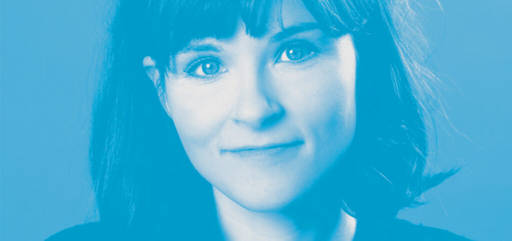
I’m a theatre poster designer, and have been for the last 13 years or so. I’ve always been really passionate about theatre since I was little and my first hobby was ‘mekkin things’ (toddler shorthand for ‘making things’). Art and theatre were always what I wanted to do and when I left university I applied for my dream job at Dewynters. I got a job there first as a marketing assistant, then after a few months I was moved into the studio because I was rubbish at marketing and not so rubbish at designing. I was there for three years and then I left and did my own thing. Now I run my own business, Rebecca Pitt Creative, designing theatre posters for all sorts of clients, big and small.
How did you become a poster designer for theatre?
I was not great at the marketing job I had, I’d quite often forget to send emails! The marketing team were lovely, but it wasn’t the right job for me. Dewynters used to have these Christmas parties with competitions where everyone was encouraged to be a bit creative, and the first year I was there the competition was to paint a portrait of someone else in the company. Luckily for me I’d been painting portraits since I was about 15 so I thought, ‘I could nail this’. I did a lovely portrait of Roger from Tourism. They were all on display at the party and then I think someone senior said, ‘why aren’t you in the studio?’. So literally the day after the office party I asked the studio manager if I could move to the studio, and after bluffing my way through an interview (sure I know how to use inDesign)…they agreed! So a bit of an unusual way in!
What process do you go through to extract the visual identity of a show?
The first thing I do is ask the client (most often the producer) to send me everything they know about the show so far. Usually it’s a script, but sometimes it’s a devised piece with just some vague descriptions and ideas, sometimes it’s a soundtrack (or some rough demos recorded on a piano). If they have appointed a set and costume designer that’s great because then I can be sent a mood board of how the show might actually look and feel, which is a massive help. A script isn’t always enough – I need to know about the ideas for the production, particularly if it’s not new writing. If someone is doing Hamlet it’s not really enough to know the script, you need to know what this production is going to be like, what the director wants to bring out and that sort of thing. I try to think, ‘What am I trying to say about the show, what’s the most exciting thing that will persuade someone to want to see it?’ Often that’s different from what the director thinks is important about the show because the poster is about selling the show to people who haven’t seen it yet. I try to identify the most exciting thing, and work out how to represent that in a visual form.
What’s your design process?
The process varies depending on the concept. Sometimes the idea involves a photoshoot in which case I brief the photographer, get the photos done first and then I’ll work on the composite, title treatment and background and things. Sometimes the idea involves me making something myself then photographing it. I love it when the process involves me doing something real (rather than in photoshop), I *especially* love it when the play is Hansel and Gretel and I get to make a gingerbread house.
What makes a successful poster?
A successful poster should be intriguing and make you want to find out more, I don’t think a poster needs to tell you everything about a show, you need to look at it and think, ‘that looks interesting’, then you can go and read about the show.
Do you have a favourite poster design that you didn’t do and if so why?
There are so many, but the first that comes to mind is the poster for the NT’s Threepenny Opera which I think was done by Louise Richardson who works at the NT’s design department.
I like that it’s all handmade, it’s all stapled on and bashed together. It’s got the whole Brecht signposting thing going on, and it’s got so much movement and violence to it because she’s literally just taken the various bits and stapled them together. I love collage – it doesn’t always work for theatre, but it’s really right for that show. They could have done a lovely broody photo of Rory Kinnear which would have sold the show fine but this is just so much more interesting.
Could you tell us about a few of your memorable designs, either because they were a challenge or because you’re really proud of the result?
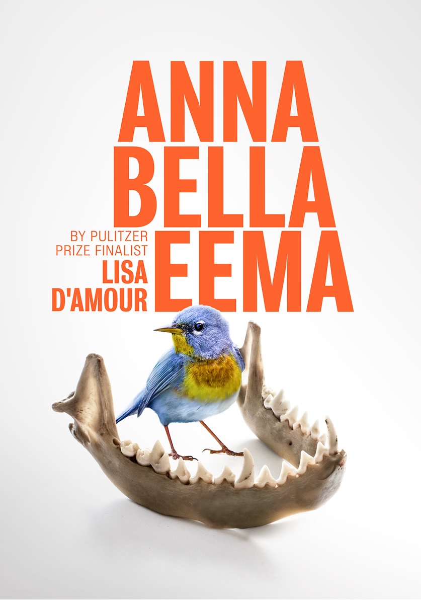
Anna Bella Eema
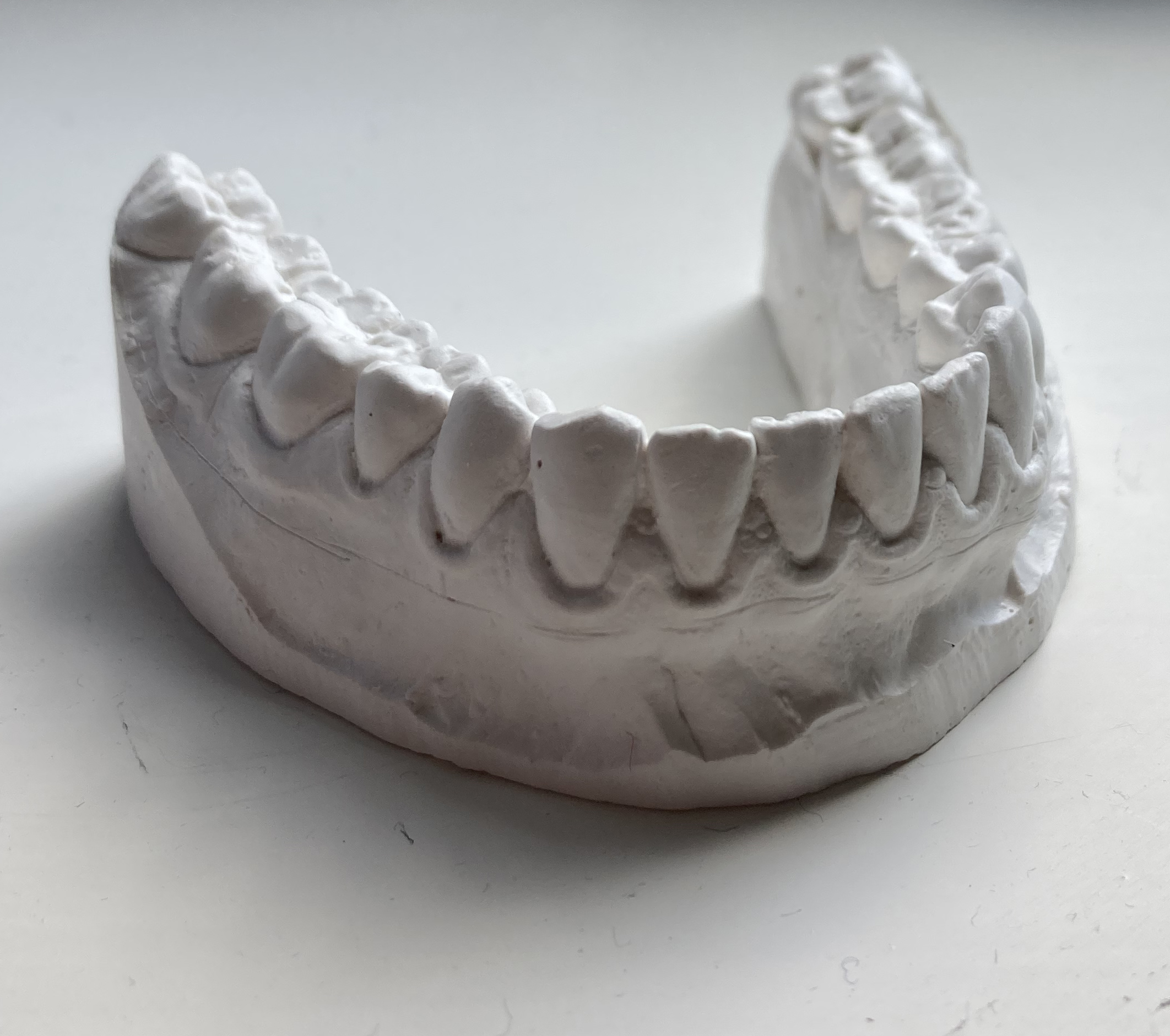
When I read this script there were just so many visual ideas for me to work with. I remember there being a metaphor of an exotic bird, a beautiful, delicate thing being brave in the face of danger, and at some point one of the characters finds a jaw bone from an animal. I bought a fox’s skull from eBay (which turned out to be two separate straight parts of a jaw rather than a semi-circular thing), and mixed it in photoshop with a plaster of paris mould of my own jaw (which I have from when my teeth grinding mouthguard was made!) to make the shape of the jaw of an unknown animal, and then I put the bird in the middle. I love how clean the result is, it’s beautiful but also a bit unnerving.
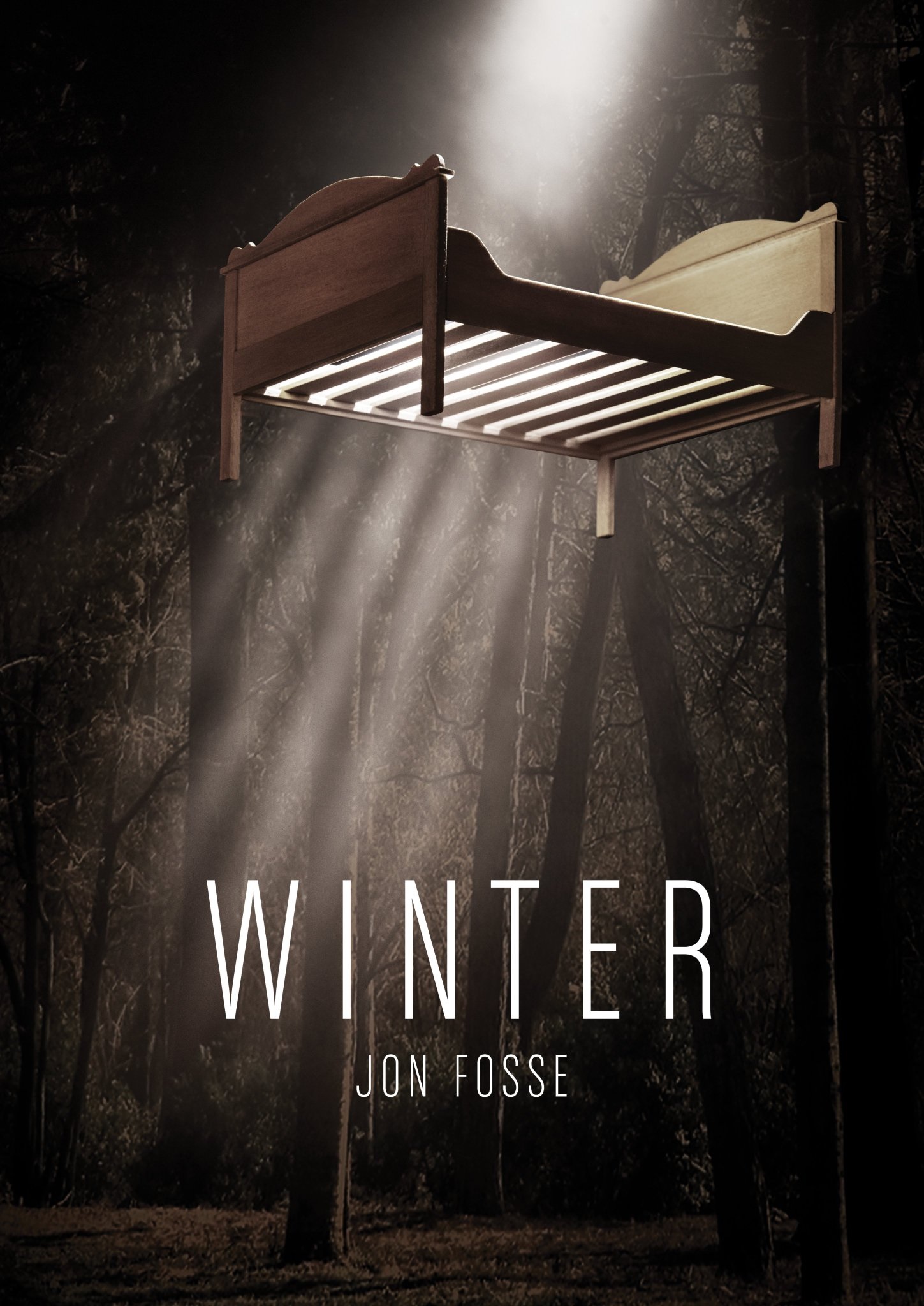
Winter
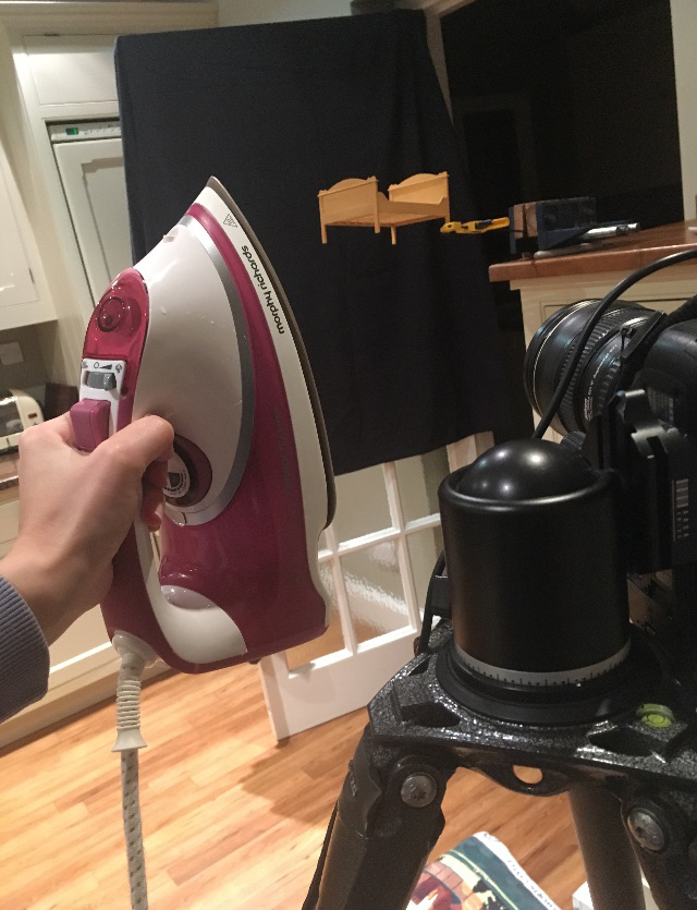
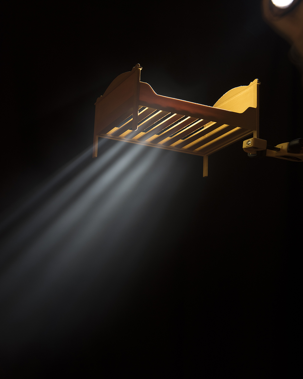
The idea came from the script – it was set in a forest and there is a description of a bed hanging from above. I suggested the image of the hanging bed to the client who said, ‘great, do it!’. And then I thought ‘How do I do that?!’. Clients often assume you can just get stock images of anything, but it’s usually harder than you think. I bought a doll’s house bed from Ebay and with my dad’s help we clamped it to a shelf. My dad went underneath it with an iron, pumping out steam, and I stood above holding a torch, shining it down through the bed to get the film noir stripes of light. The final image looks so serene and beautiful but the process was rather farcical!
Children of Eden
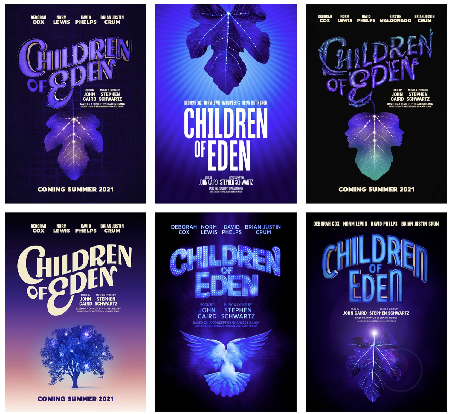
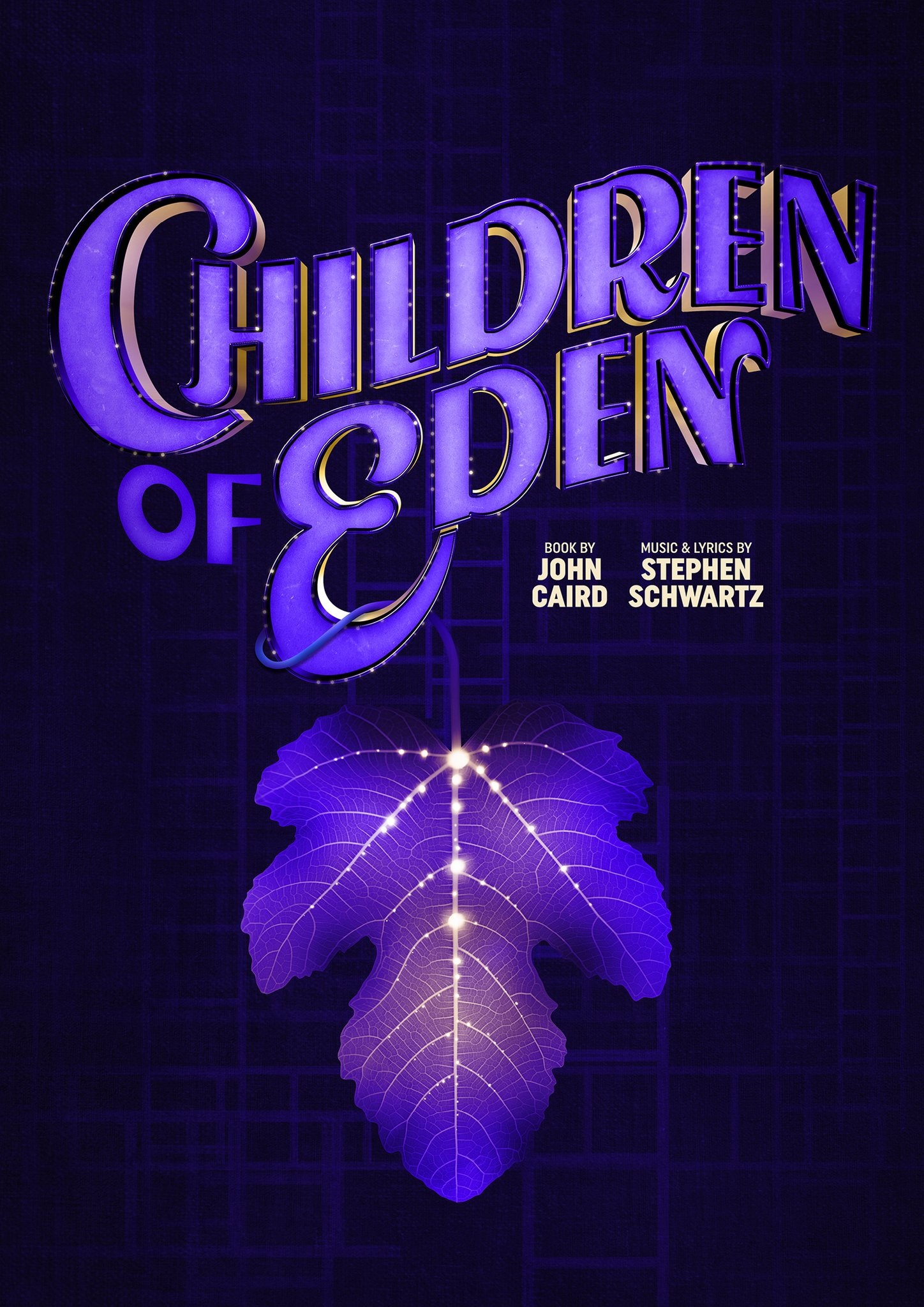
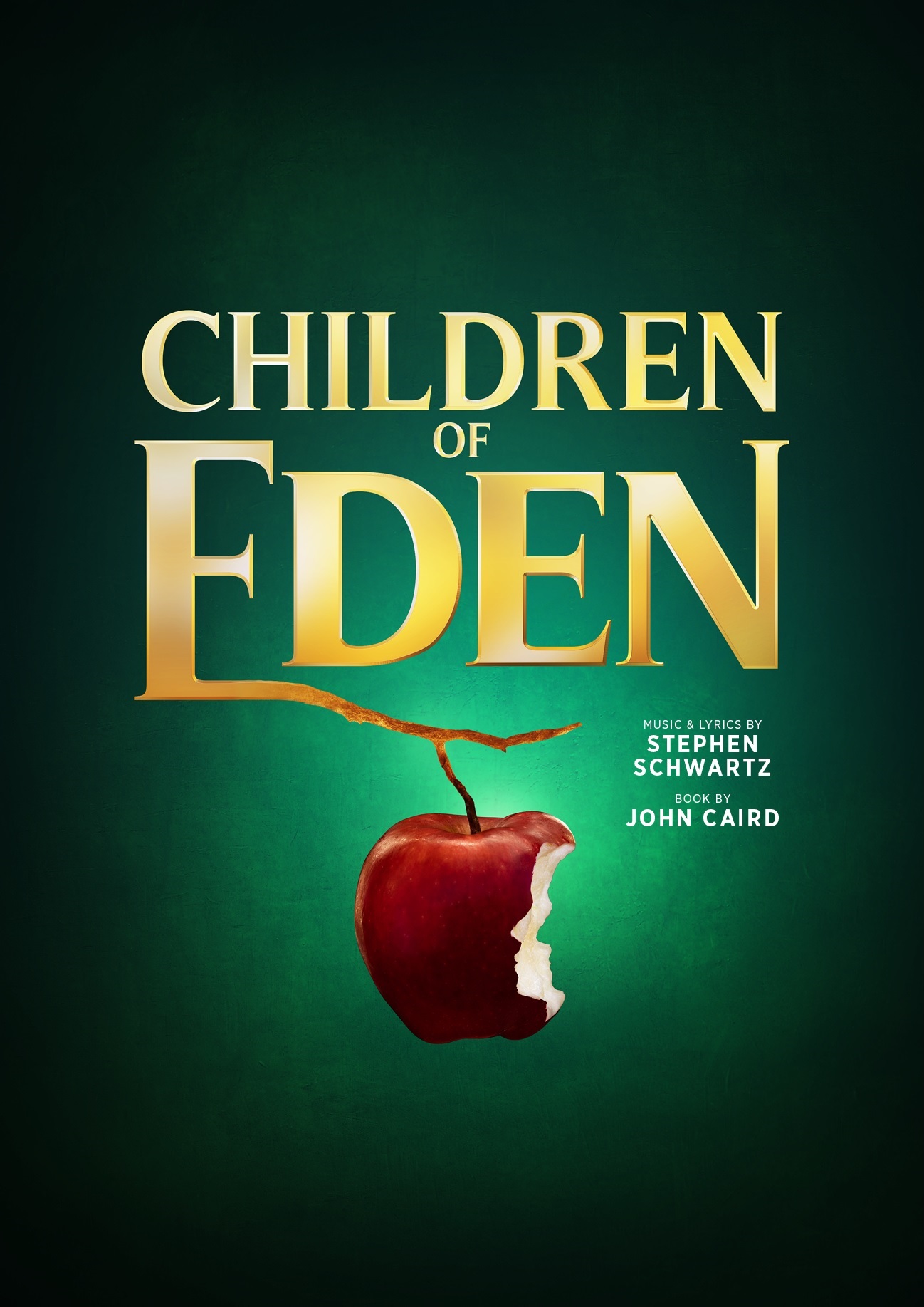
I often get asked to do a show I’ve already done before, which can be challenging because I think, ‘I’ve used all my really good ideas for that show’! However in this instance, it was great because the two productions were so different. The first one I did was for a lovely client who was producing a concert version of Children of Eden at the Cadogan Hall. It was going to be a concert performance of the songs, as they were written, with no unusual interpretations or anything like that. I had the idea that the apple could grow out of the typography, and become the faces of Adam and Eve. I bit into apple, then adjusted the shapes of the bite with a stanley knife until it looked like two faces (doing it in photoshop wouldn’t have looked as good!). I was really happy with it and thought, ‘this is my Children of Eden’. Then a few months later I was asked to work on a Children of Eden again for a production in Chicago, which initially worried me, but luckily this was quite a different production. They already had a spectacular production design, which included massive puppets and UV lights – it was almost like a slightly creepy fairground with a hint of Avatar. I had some great images of the set to use as inspiration. I rarely get to see the full set design in advance, but when I do the results are so much more specific. I designed some typography that had a bit of a fairground/Coney Island vibe. I had the idea of a fig leaf where the veins in the leaf become a family tree, with all the generations coming down from Adam and Eve. I was thinking ‘where am I going to get a fig leaf from?’. I had about a week to do this, and I wanted to use a real fig leaf, but I happened to go on a walk with my parents to a National Trust property and guess what was there?!
Pippin
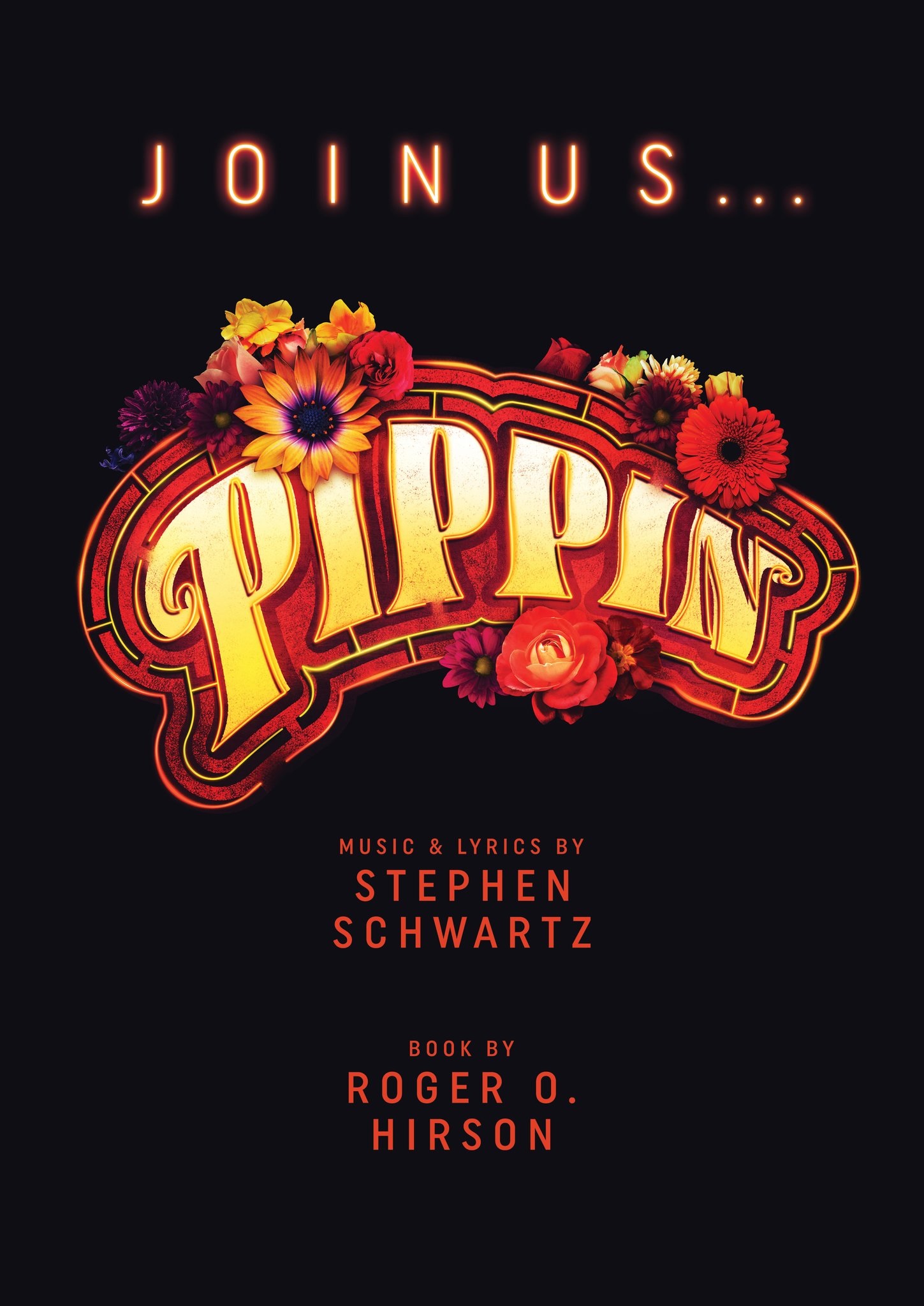
When I got the brief for Pippin I was initially worried that all the good posters for Pippin had already been done. Fellow designer Steph Pyne had done a gorgeous Pippin poster a few years ago which I had admired, and I thought it would be hard to make anything as good as hers! However when I spoke to the director and the designer there were some very clear ideas about the design of the show itself (and luckily it was very different from the one Steph had done!). The aesthetic was inspired by 1969 summer of love – druggy, trippy, draped hippy fabric and flowers in hair, and there was going to be a mediaeval maze painted on the stage. I loved this idea of a maze – Pippin trying to find his way in the world. If you look at 70s typography there’s a really common trend where the letters are offset so you’ll get the first layer, then a bigger version, sort of going out in stripes, and I thought I could make those stripes into a maze that leads into the title. I liked that I managed to get the maze in there, along with the recognisable 70s vibe.
Pippin is very dark musical. This version was a lot more joyful than some, but it is still about a suicide cult so I wanted to use the black background, it’s not got any texture to it, it’s just dark. It’s like, ‘the world is a dark place but we can light it up for you, with our creepy cult’! I liked the idea of a really enticing floral loveliness in the middle of the darkness. I went to see the show last week; sometimes I think, ‘ah if I’d known it would be like this I would have done the poster differently’, but with this one, I actually think the poster represented it really well.
Bluebelle
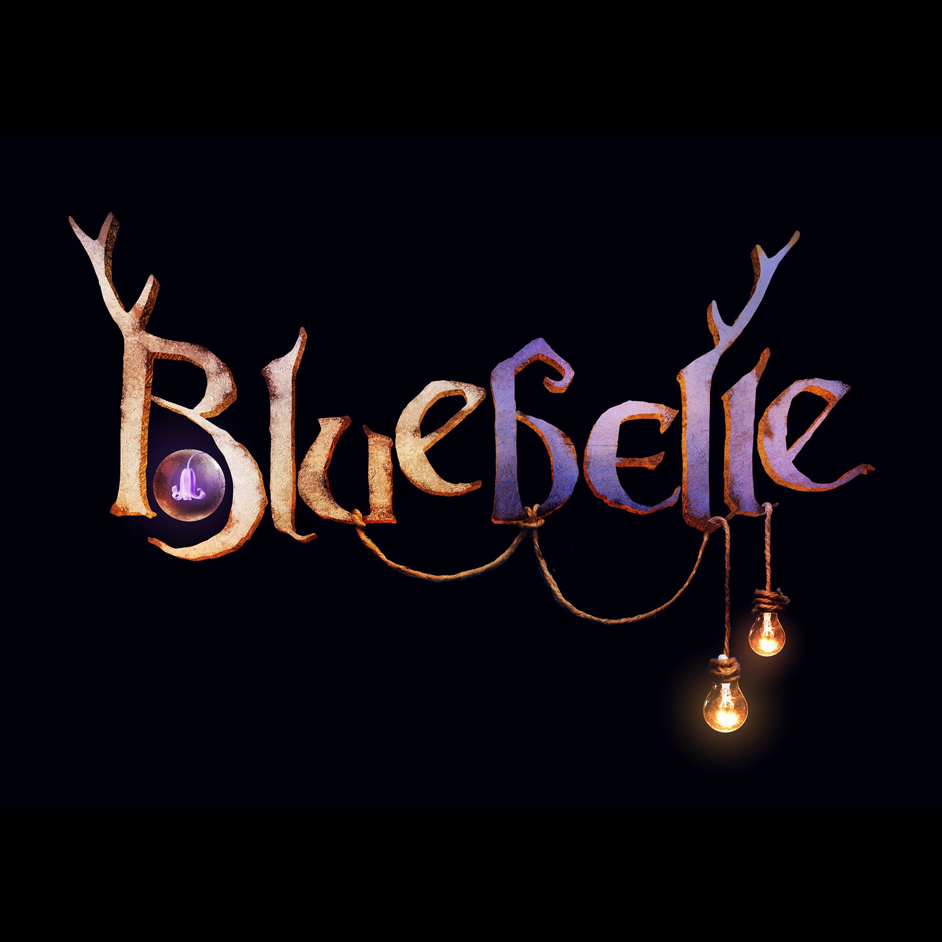
I love working on devised shows. With theatre Re’s Bluebelle the performance style is corporeal mime so there’s no script, but I’d been told what it’s about, and I got a whole load of pictures of the work in progress…but as it’s a devised piece, it could end up totally different! This was a lovely project to work on. I love fairy tales – you can do so much with the typography. Bluebelle is a show that nicks stories from different eras, and the typography is like that too – one of the ‘E’s in the title is a Celtic style ‘E’, but the rest it a bit more blackletter-inspired, and there’s a bit of Victoriana in there too – the costume design for the show is the same.
With Bluebelle there are lots of hidden things in the design – it doesn’t matter if people don’t spot them, but I know they are there. The capital B is shaped like a side view of a pregnant woman’s body, then there’s a little womb in there with a bluebell growing in it. There are some bits of ropes (umbilical cord!) and two lightbulbs which represent the mother and father. I like putting extra hidden visual things in. In my poster for Amelie for example, the title is in the shape of a smile, and you wouldn’t necessarily spot that, but to look at it it gives you a happy feeling. You maybe don’t know why it feels right when you look at it, but it’s all done on purpose!
How often do you see a show and see the final result match your design?
Sometimes I see the show and think I got the tone slightly wrong – it should have been a bit more fun, or a bit more serious. Sometimes I see it and think, ‘that wasn’t right at all’, but that’s usually when I’ve come on board so early that there weren’t many ideas for the production at the time.
How much does the concept design for the production influence your work?
Ideally totally, because it’s the look and feel of the show. Sometimes the feel comes from the performance style or the music, but a big part of the look and feel is how it actually looks on stage, so if I can use that as an influence then that’s ideal. There’ve been a few times when I’ve had really nice collaborations with set and costume designers because they’ve been brought on board early enough to get involved with the poster. But sometimes it’s just too early in the process to know what the production design will be like.
How would you say visual communication differs from poster design to production design?
I think the big difference is that poster design is about selling the show, which feels a little bit cynical sometimes. I’d love to be a prop designer – I did a game design job for a theatre client last year, and it didn’t have to sell anything, it just needed to look beautiful and fit in the world of the story, I loved that. But essentially posters are a sales tool, and the face of a show, so they are very different from the set and costume design. When it’s really fun is when the main selling point is the inventiveness and beauty of the show, then you can have an inventive and beautiful poster!
What is the most challenging part of your job?
The most challenging part is waiting for inspiration, because sometimes it doesn’t come straight away. I often read a script and ideas pop into my head whilst I’m reading, but sometimes it takes weeks, and I can get very stressed about it. That happened to me recently and I got very anxious about it, but I’ve learnt you’ve just got to relax, have a bath, and inspiration will come. I call my designer friends and we share ideas sometimes which is great. Not everything can be your best work, you will die of stress if you try and make everything perfect. Clients have very high expectations – they have seen the best of my work and they want the perfect poster. Sometimes they have looked at my website and they say they want something like the Amélie poster and I think, ‘you’re doing a one-man show about bereavement – it can’t be like the Amélie poster!’.
What design rules do you keep coming back to in your work?
The main thing for me is to try and strip it back to the simplest thing – how do you distill this idea into its most striking form. Some productions are all about maximalist design values and I’m happy to put all the bells and whistles on if that’s what’s required, but I think for me, my taste is to try and make things as stripped back as possible. The Anna Bella Eema poster is a good example – white background with two things – the teeth and the bird, and un-fussy typography. It was very complicated to do but the idea is simple.
Do you have an aesthetic or style that you think defines your work – what makes a Rebecca Pitt design?
I try to take the style from the script or the production design – ideally it shouldn’t be about me and my style, it should be about the show. I often have friends tell me though, ‘oh I knew that was one of yours’, so I must have a bit of a personal style…
How do you know when you’ve smashed it out of the park?
Sometimes I have an idea and I think ‘that’s it’. I usually send that one idea straight to the client, saying, ‘I can try other things if you like, but I think this is the one…’ Usually the client will agree and then we can be excited about it together!
What is the most rewarding part of your job?
I love seeing shows announced, and knowing that my artwork is being seen by people! I love seeing the excitement people have about a show. One of the sad things about lockdown was that I did loads of really nice posters for the Edinburgh Fringe, some really great plays with lovely posters that will never be seen. Maybe after next year’s fringe, if the show definitely isn’t happening, I’ll put them out in a blog!
What are your top tips for any designer making their first show poster?
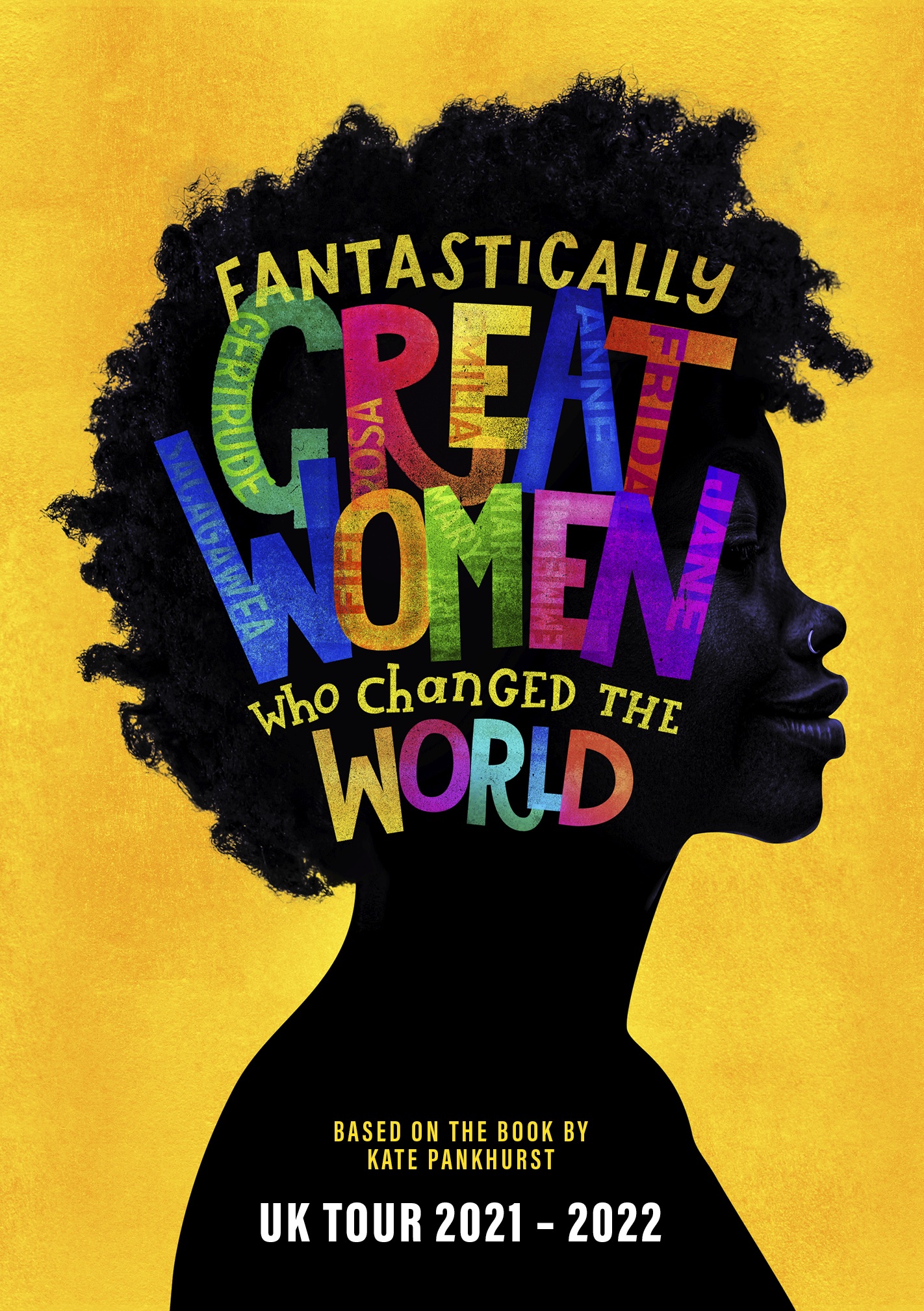
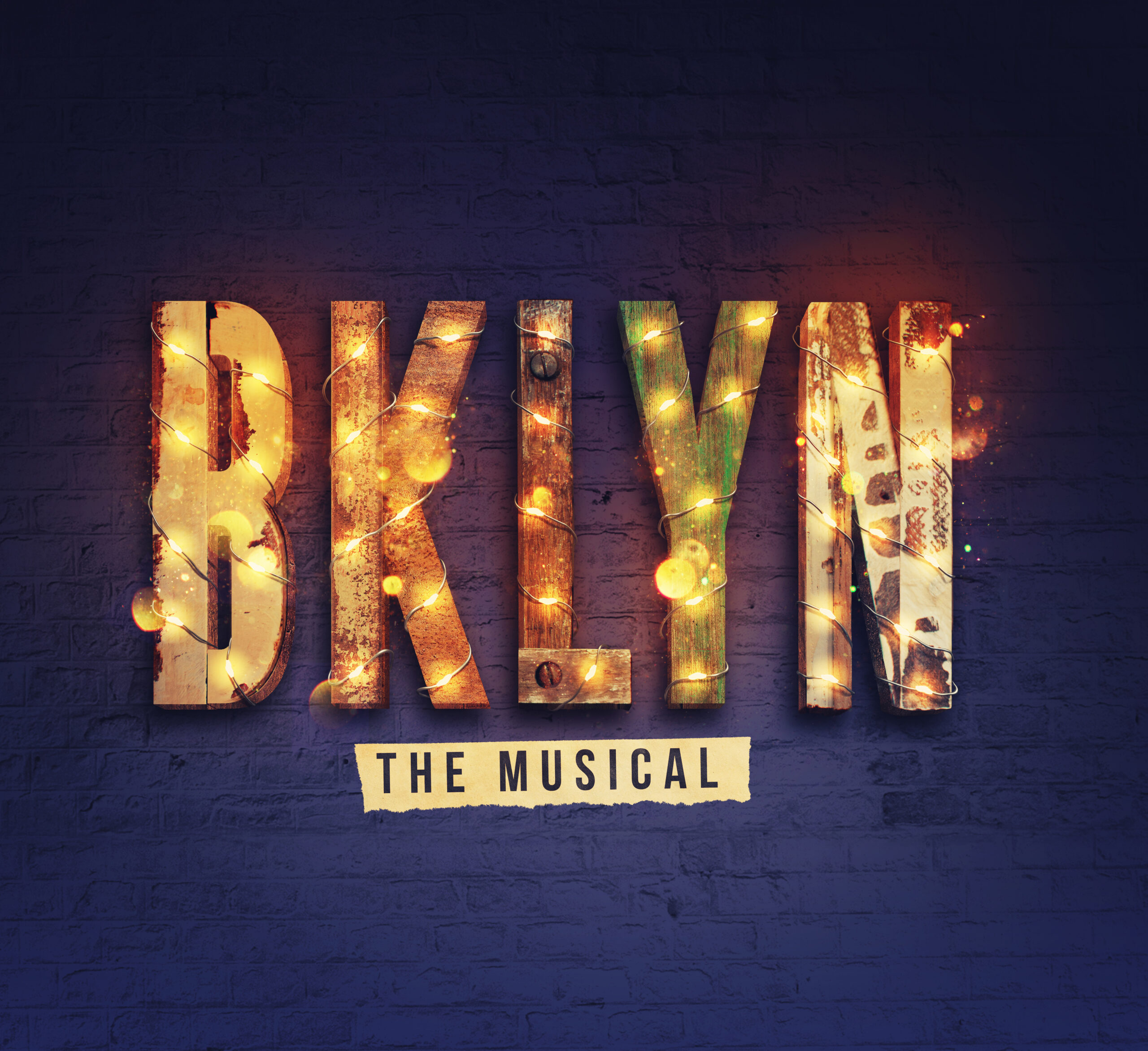
Keep it simple. I would ask yourself what the most exciting thing is about the show and think about how to represent that in its boldest simplest form. Don’t try and tell the story. Don’t try and do everything with the poster. One thing I would recommend is that if you can do it for real rather than in photoshop, then do. There’s a lot of ways of making things look real in photoshop but they aren’t ever as convincing. I did a poster for BKLYN that needed to look handmade and urban, so I made the letters out of an old shelf, and I wrapped wire things around it then photographed that. Great tip: If you want something to have a screen-printed effect, but don’t have the time for a laborious screen print process, get yourself a gelli plate and you can do such simple things with that. My poster for ‘Fantastically great women who changed the world’, features typography for that is all done with a gelli print.
More of Rebecca’s work can be seen on her website.
The interviewer was Emma Tompkins
